MY ROLE
Visual Design
TIMELINE
2018
Challenge
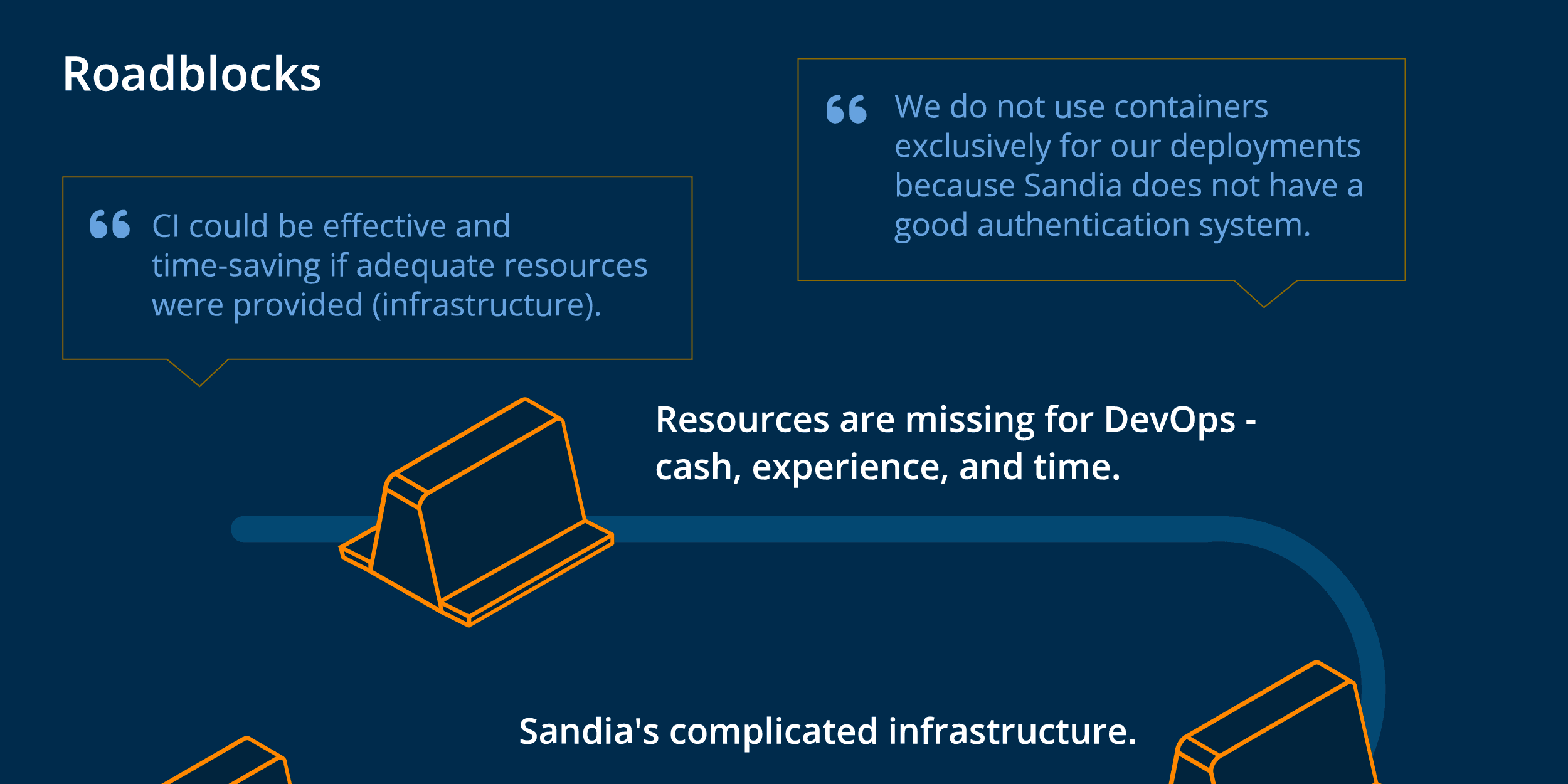
DevOps at Sandia was in need of standardization, staffing and funding. With this in mind, UX researchers on our team embarked on a series of user interviews with development teams across the labs to get a sense of the current state of DevOps at the labs. This, along with survey data, provided us with the information we needed to explain the current state, but the team needed an infographic to help visualize the data.
Design
When reviewing the data, our team determined common patterns and qualitative insights that we wanted to depict in the infographic. I organized the infographic into categories of data, using the patterns we identified in order to tell the story. The infographic was distributed across the labs to inform development teams and management about the current state and what could be done to take the next steps.

