MY ROLE
UX Research, UI Design, Front-End Development
TIMELINE
2022-2024
Challenge
INSIDE serves as Sandia National Laboratories' intranet hub, delivering company news and employee resources. The redesign addressed key user pain points: limited integration with lab applications, difficult information discovery, and lack of personalization options.
Objectives

Tie INSIDE with enterprise applications at the labs to bring a more integrated experience for users.

Provide customization options and user profiles for employees to easily locate personal information and network with others.

Reorganize and optimize the layout of INSIDE to accommodate new functionality and content.
Results

An influx of positive feedback from Sandia employees noting the new customization and integration features of the new INSIDE.

A significant decrease in the amount of time spent among employees locating information relevant to their employment.

Praise from stakeholders across various organizations relating to the integration of their data into INSIDE (e.g. Enterprise Reporting).
Research
Research tasks were completed to identify user pain points, determine requirements, and generate new ideas. I conducted the following activities along with other team members.
Competitive Analysis
Benchmarked leading global intranets and analyzed Nielsen Norman's top intranet report to identify best practices and emerging trends for modern intranet design.
User Interviews
Reaching out to a diverse group of employees was essential to learn how INSIDE was being used the most, what was working well, and where there were pain points. I observed and participated in several of these user interview sessions.
Usage Analytics Analysis
Analyzed 4+ years of Matomo analytics data to understand user behavior, including page engagement, traffic patterns, and demographic insights across departments and roles.
Design
Whiteboarding
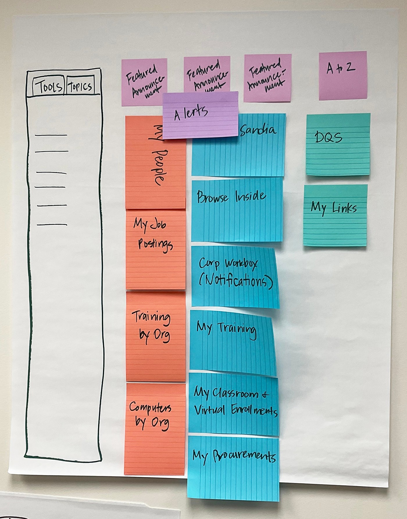
With our research data in hand, it was time to hit the whiteboard and ideate on design ideas for how INSIDE could be re-imagined. Myself and each of the other designers worked on pen/paper and stickies to generate ideas for each of the new features of the app, including a new layout and user profile page.
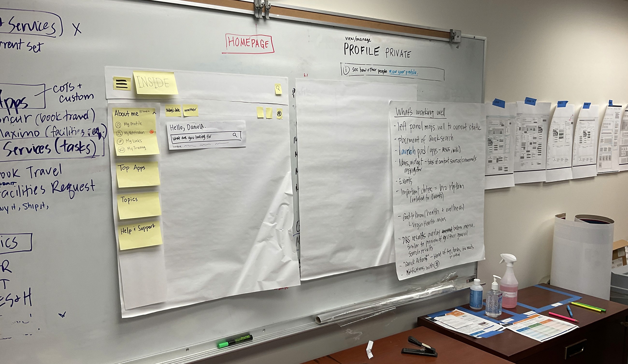
We shared our ideas and identified the pros and cons of each approach. The design ideas we all thought were most successful were identified for use in future wireframes.
Low-Fidelity Wireframing
Next, we interpreted our whiteboarding design concepts in Balsamiq wireframes, which we could put in front of users. I produced a series of wireframes that presented a new layout of INSIDE, an employee menu, employee profile, and widget-specific designs.
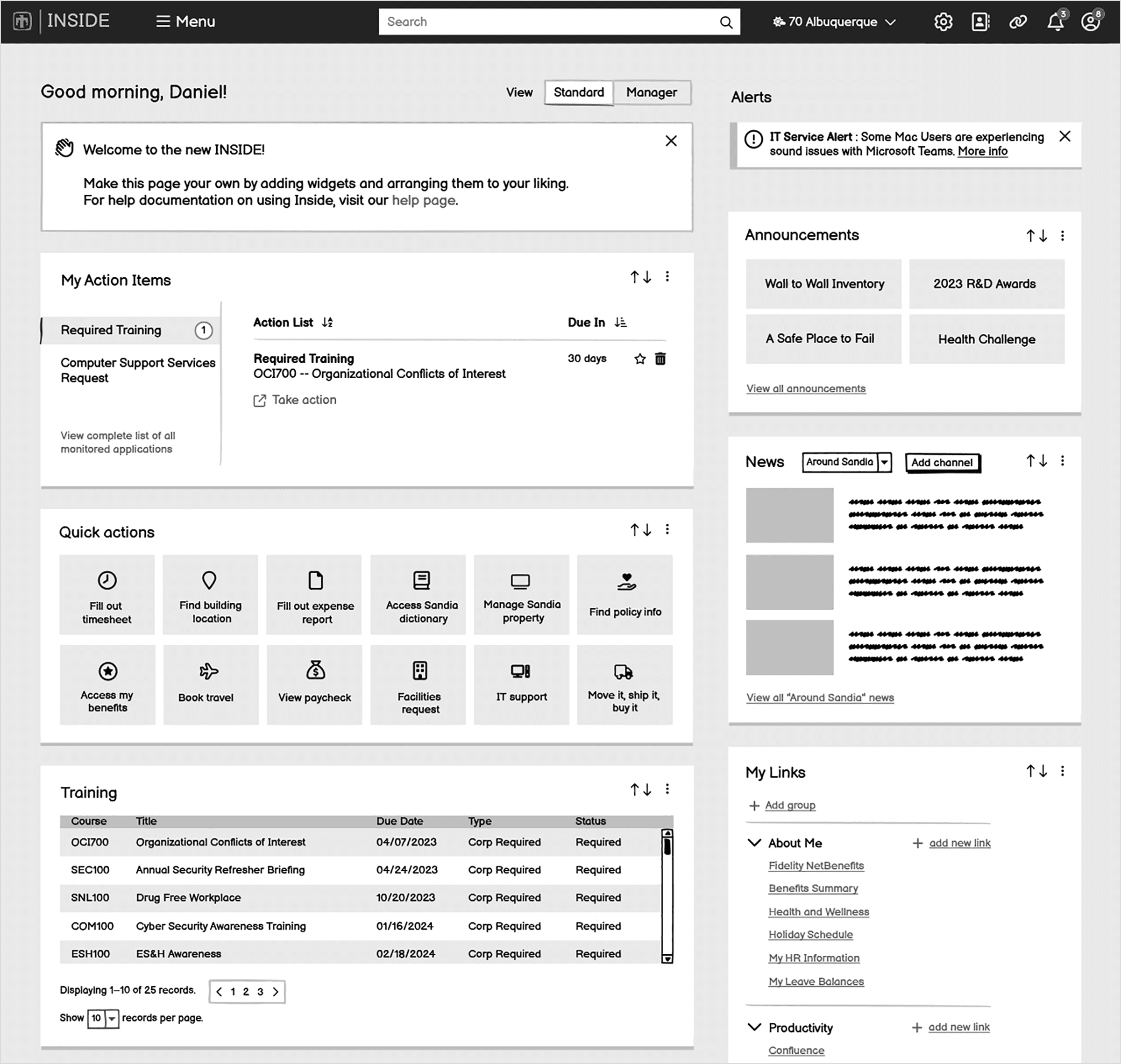
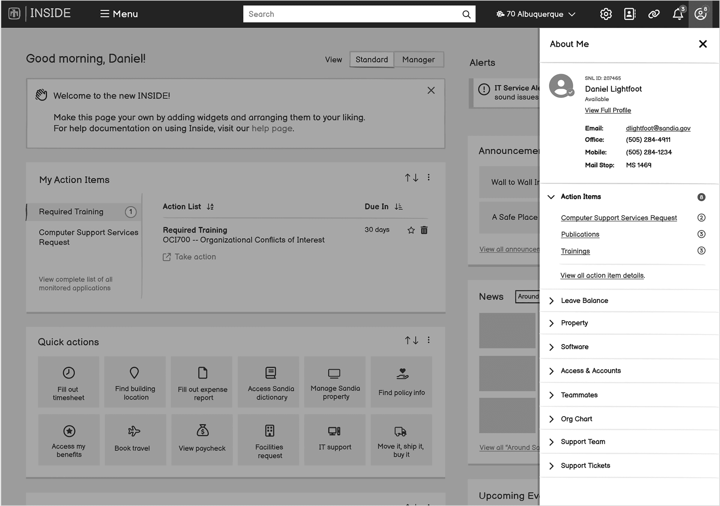
Above: Examples of INSIDE layout changes and employee menu
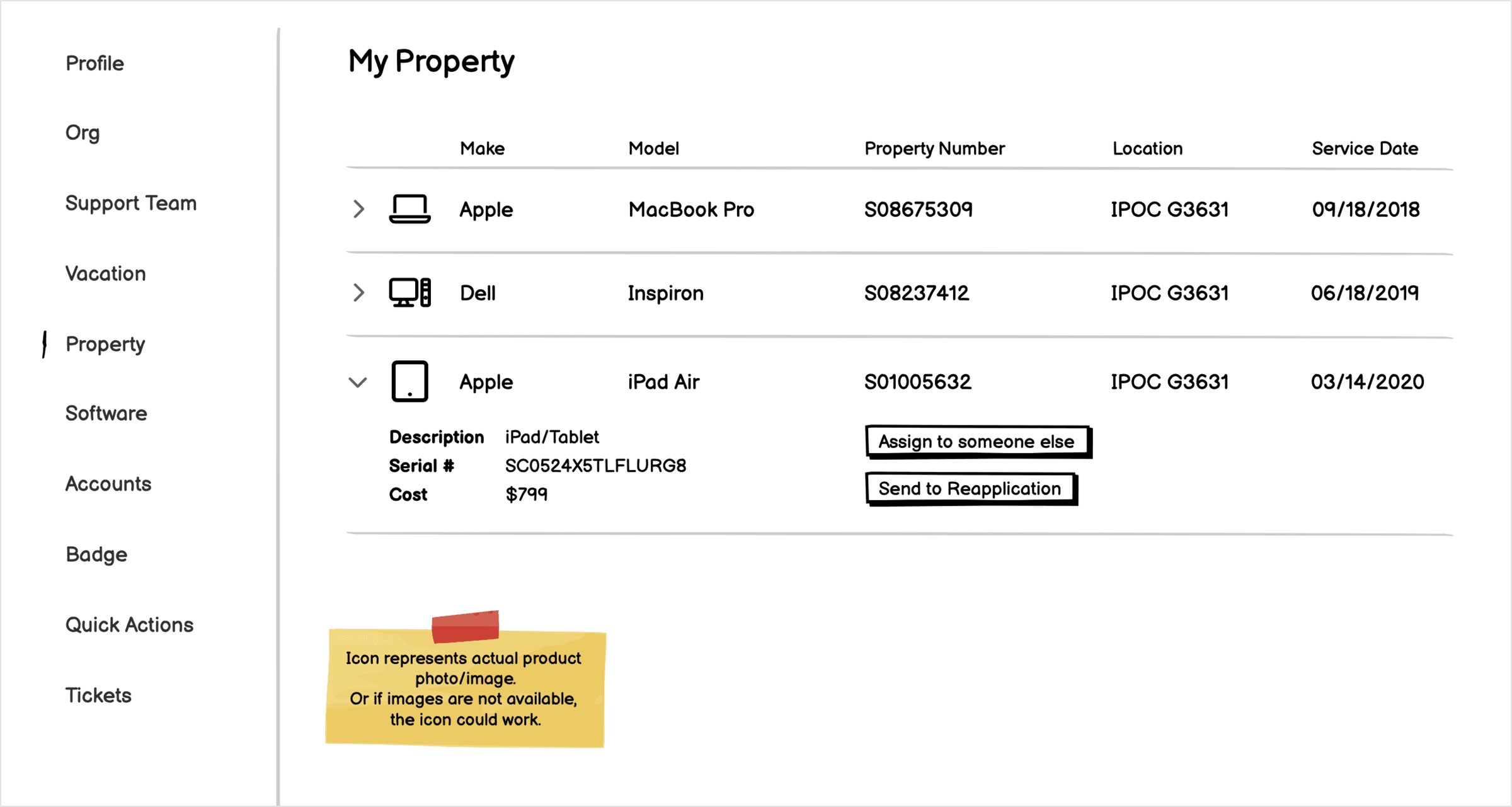
Above: Example of the Employee profile screen, which enables the user to view information about their department, leave balances, equipment and other information specific to their employment at Sandia.
Socialization and User Feedback
I partnered with UX researchers to test low-fidelity mockups across diverse employee groups, gathering feedback that shaped design iterations. I also analyzed user insights to identify patterns and refine key features.
High-Fidelity Prototyping
After wireframes were refined through employee feedback sessions, I created high-fidelity interactive prototypes with detailed visual designs and interaction patterns. These high fidelity prototypes in Axure enabled the team to conduct extensive usability studies simulating real-world tasks.
Example:
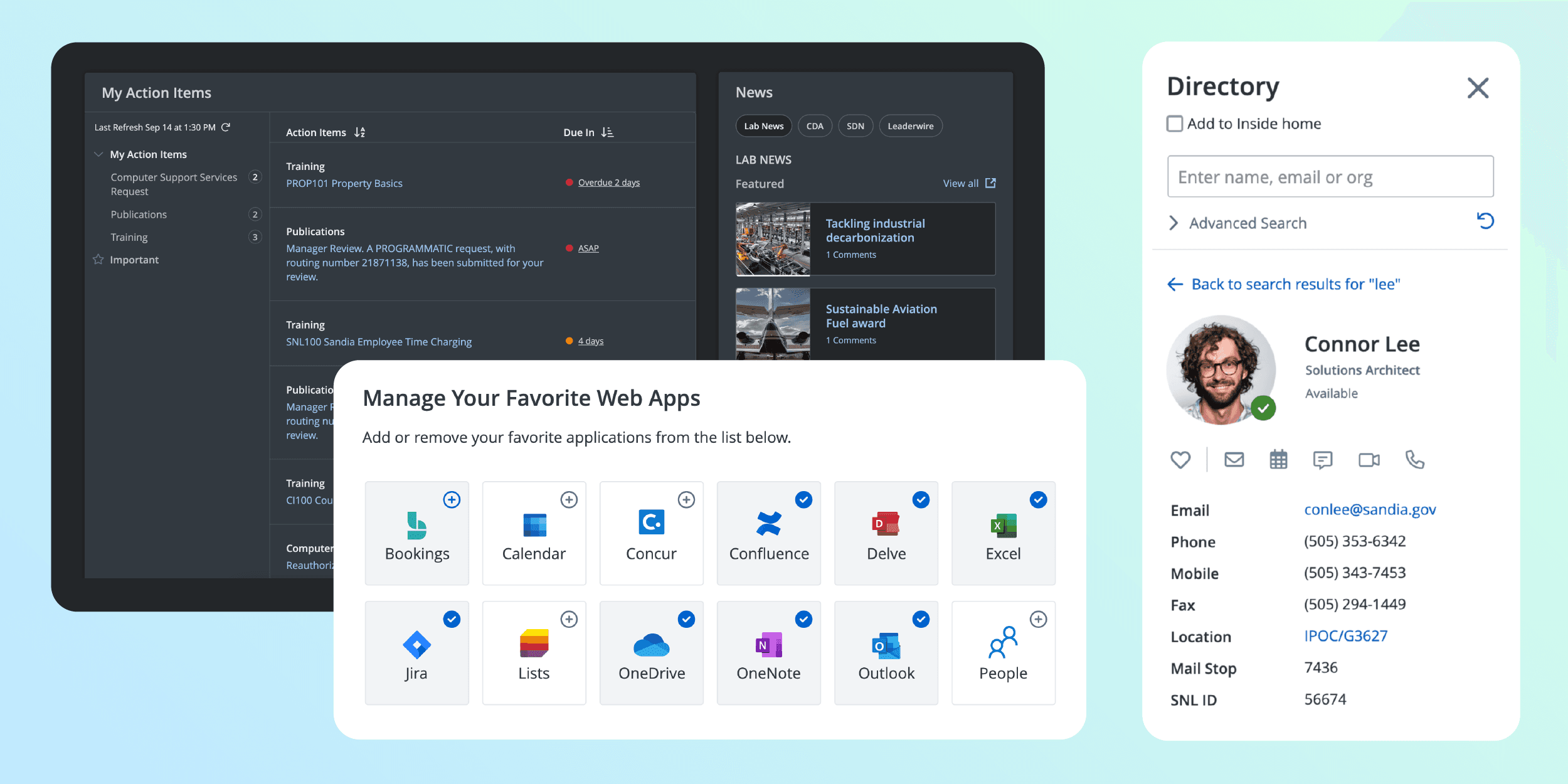
"You are a level-one manager and you need to search for an employee in another division. Please locate Connor Lee and describe his title."
Above: Example of using Directory to search for an employee
Above: Example of a design pattern in the new Favorite Web Apps widget
Above: Using the tabbed interface for the new My Recent Activity widget
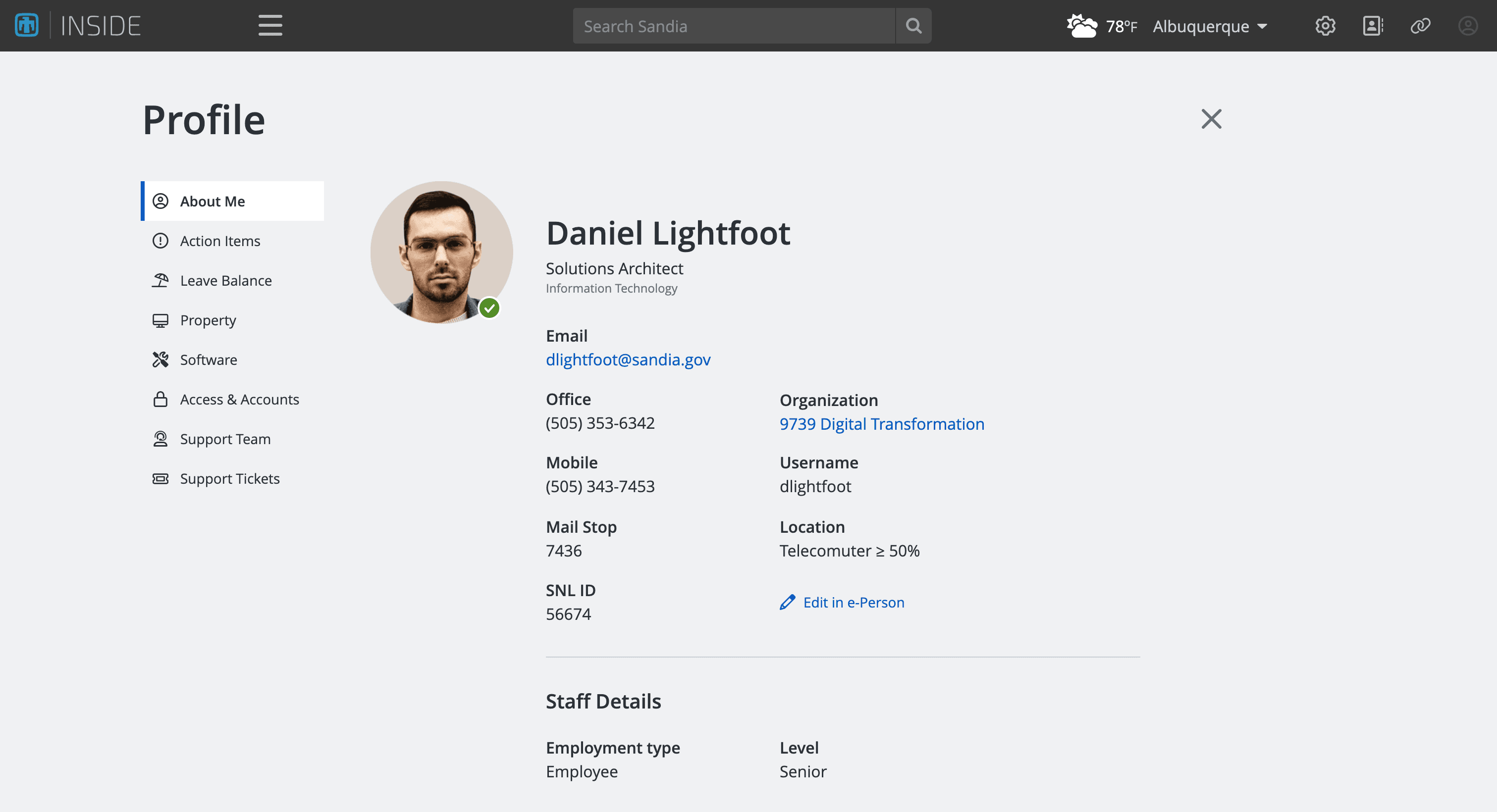
Above: Design of a new user profile page
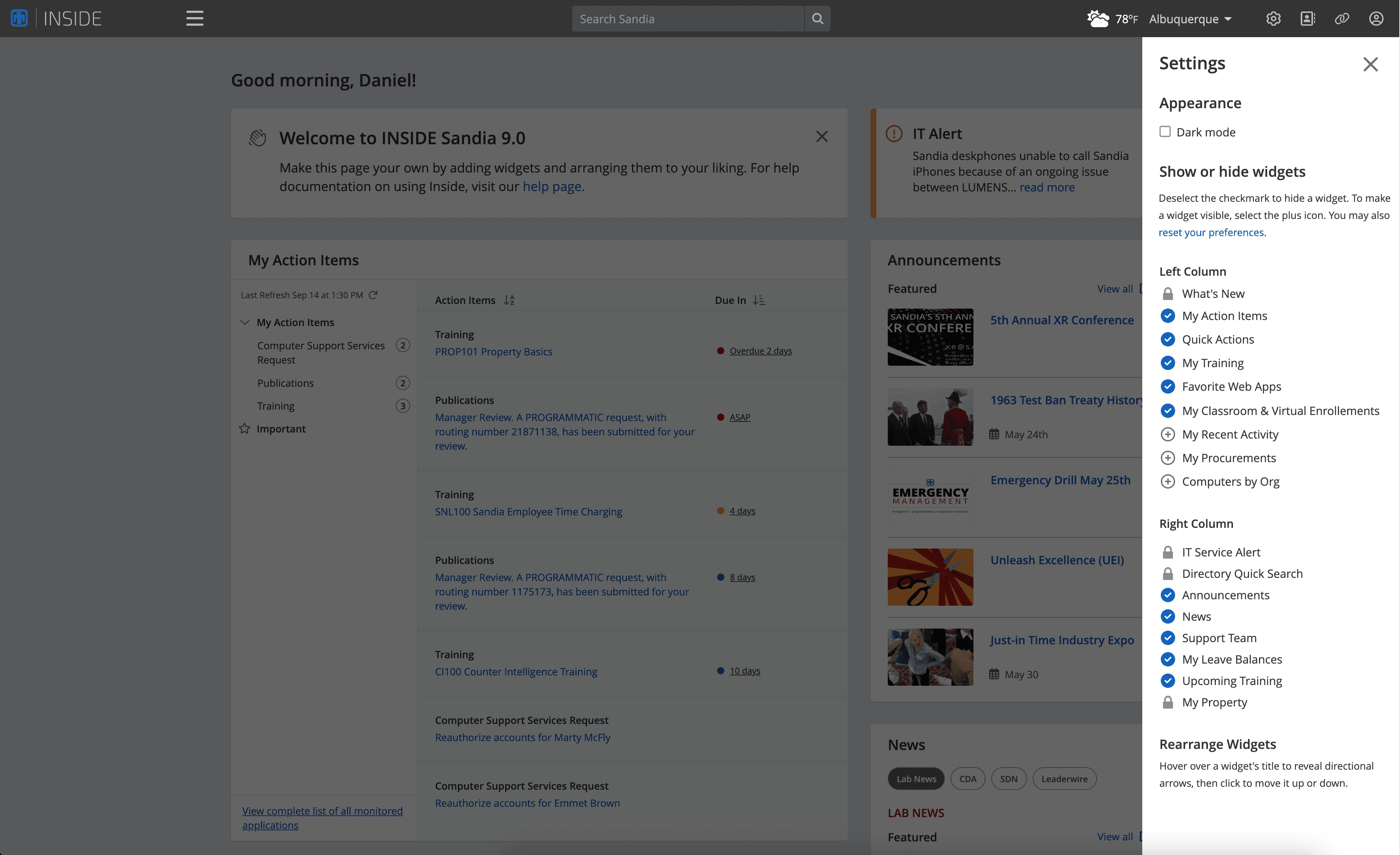
Above: A new settings fly-out menu enables the user to toggle the visibility of their widgets and toggle a dark mode, a highly requested feature
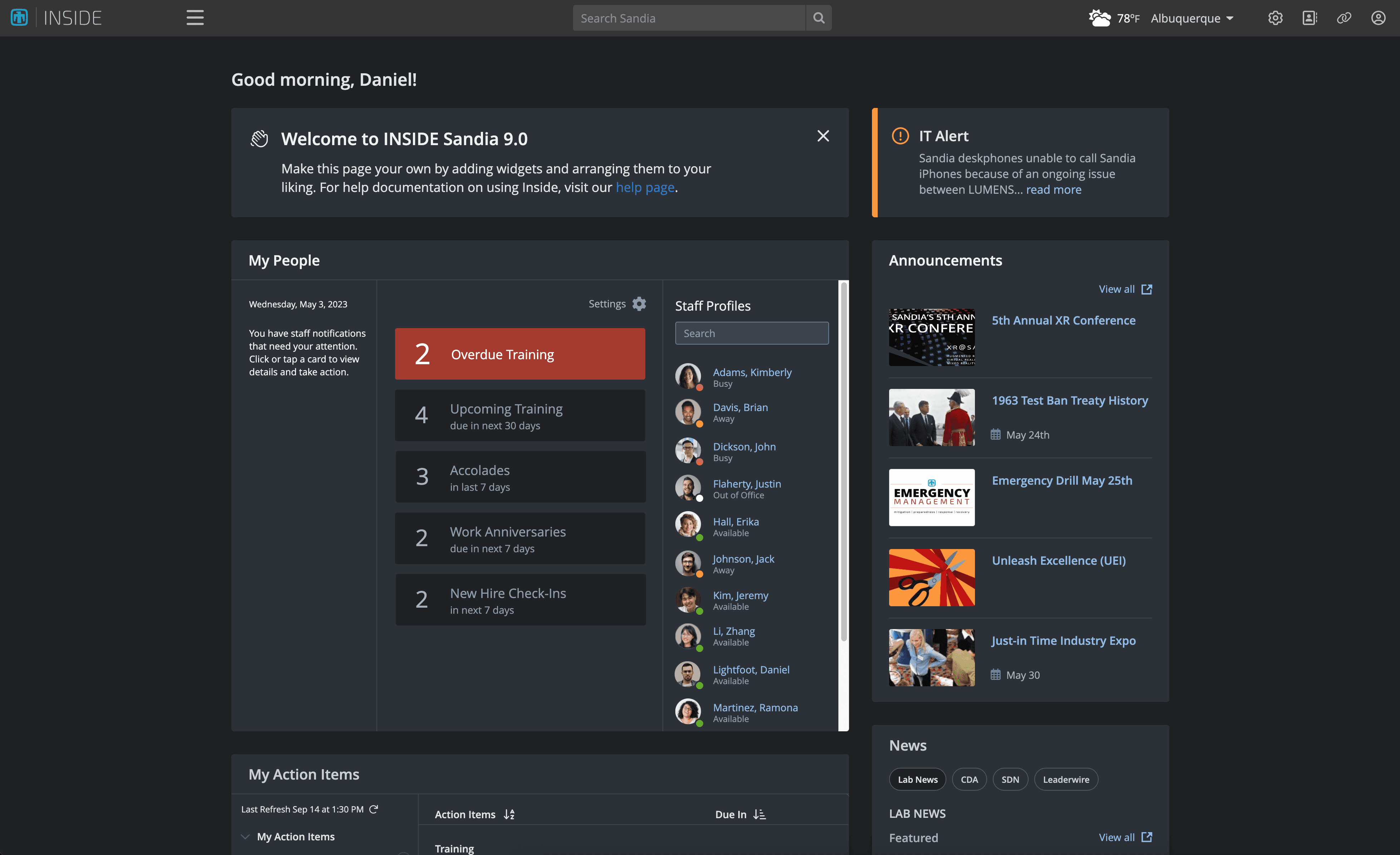
Above: Example of toggling on dark mode
