MY ROLE
UX Research, UI Design, Front-End Development
TIMELINE
2020
Challenge
Level-One Managers at Sandia have a multitude of daily tasks to complete along with their long-term planning and other strategic efforts. Completing these day-to-day tasks can be a burden due to the multiple touch points required.
Objectives

Enable managers to "clear the decks" by centralizing day-to-day tasks and ensuring ease of completion.

Provide a staff roster that enables managers to easily connect with members of their team.

Enable greater engagement with staff members to improve coordination and reduce missed opportunities.
Results

After year 1 of usage, saved ~930 hours or ~$120k. After year 2, savings climbed to ~2,000 hours or ~$237k. To date, the manager dashboard has saved $400k total.

The following tasks showed a significant time savings after manager dashboard was implemented: Locate general staff (30 sec. time savings/user); Request training extensions (190 sec. time savings/user); Locate staff accolades (74 sec. time savings/user).

49% fewer tool jumps to locate staff information and 30% fewer tool jumps to take action on training notifications.
Research
User Interviews
Our team conducted in-depth interviews with managers across divisions to identify key challenges and workflows. Research spanned various seniority levels to create a comprehensive view of managerial needs and pain points.
Use Cases
Based on our research we determine several use cases for level-one manager usage of our new dashboard.
Connecting with staff - Help managers to get in contact with staff
Completing of recurring responsibilities - Ensuring daily and mundane tasks are handled (e.g. timesheet)
Locating staff - Help managers to quickly know the current location of staff members
Determining staff availability - Know who is available and when
Tracking staff performance - Provide insight into where employees are successful and where they may be struggling
Learning how to help staff - Help managers to quickly see opportunities where they can take action to help staff members
Design
Low-Fidelity Wireframes
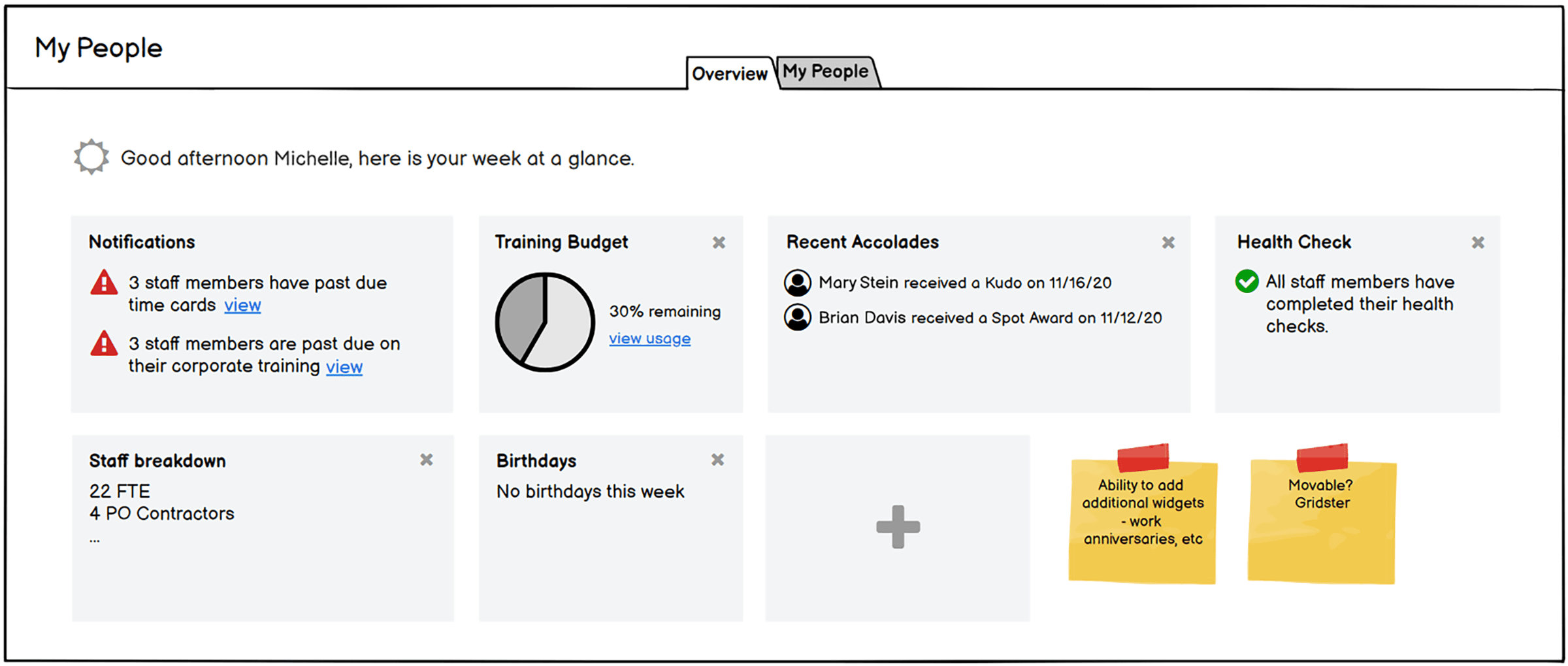
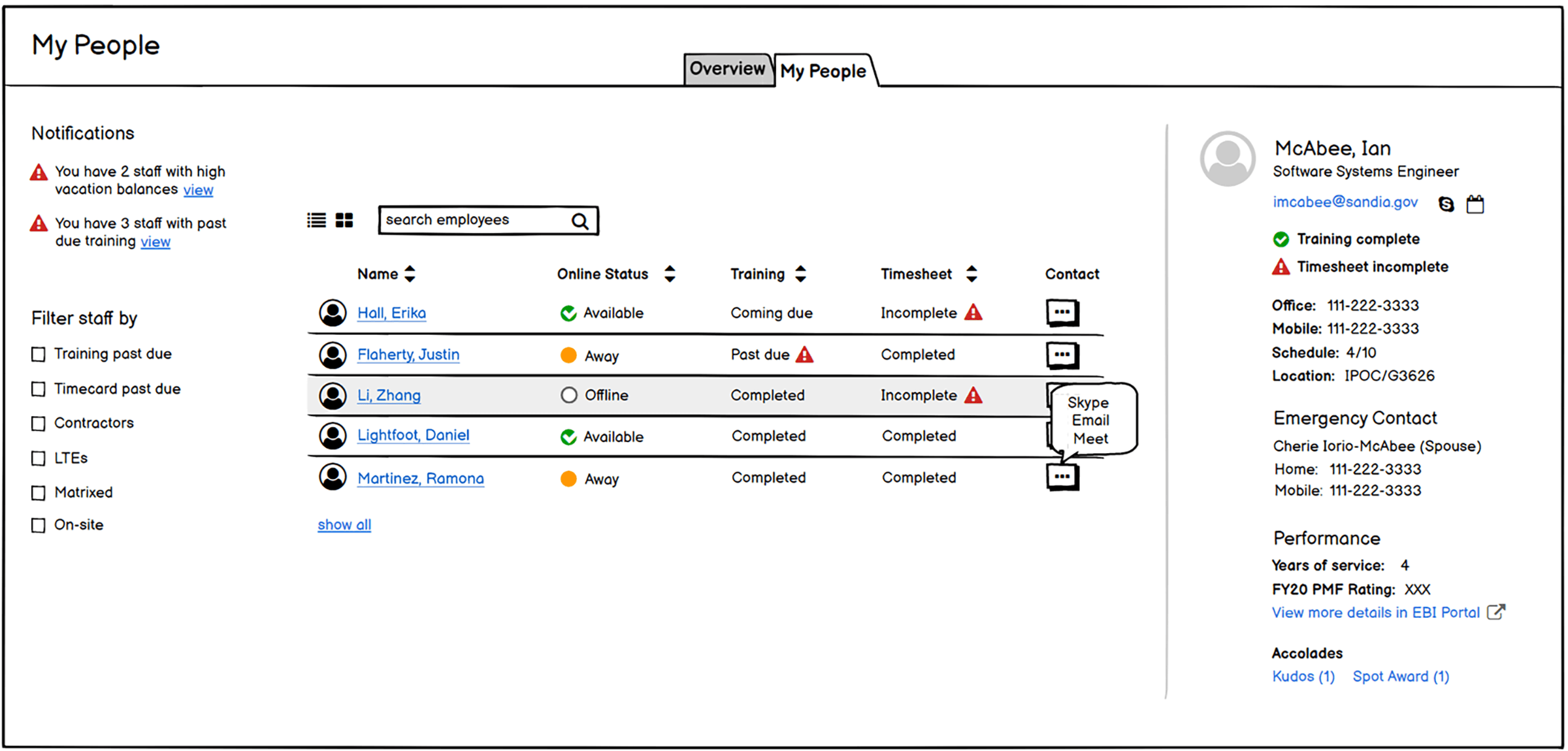
After conducting user interviews, I transformed user research insights into initial wireframes using Balsamiq, exploring various layouts and content structures for the manager dashboard.

Above: Wireframe idea of a tabbed interface including an an "Overview" section. This section would present data and notifications to managers at a high level, and enable them to drill down.

Above: The "My People" section of the initial idea that presented employee information in more detail.
I presented the wireframes to a diversity of manager levels, iterating the design based on feedback while maintaining core dashboard concepts in the final version.
High Fidelity Prototypes
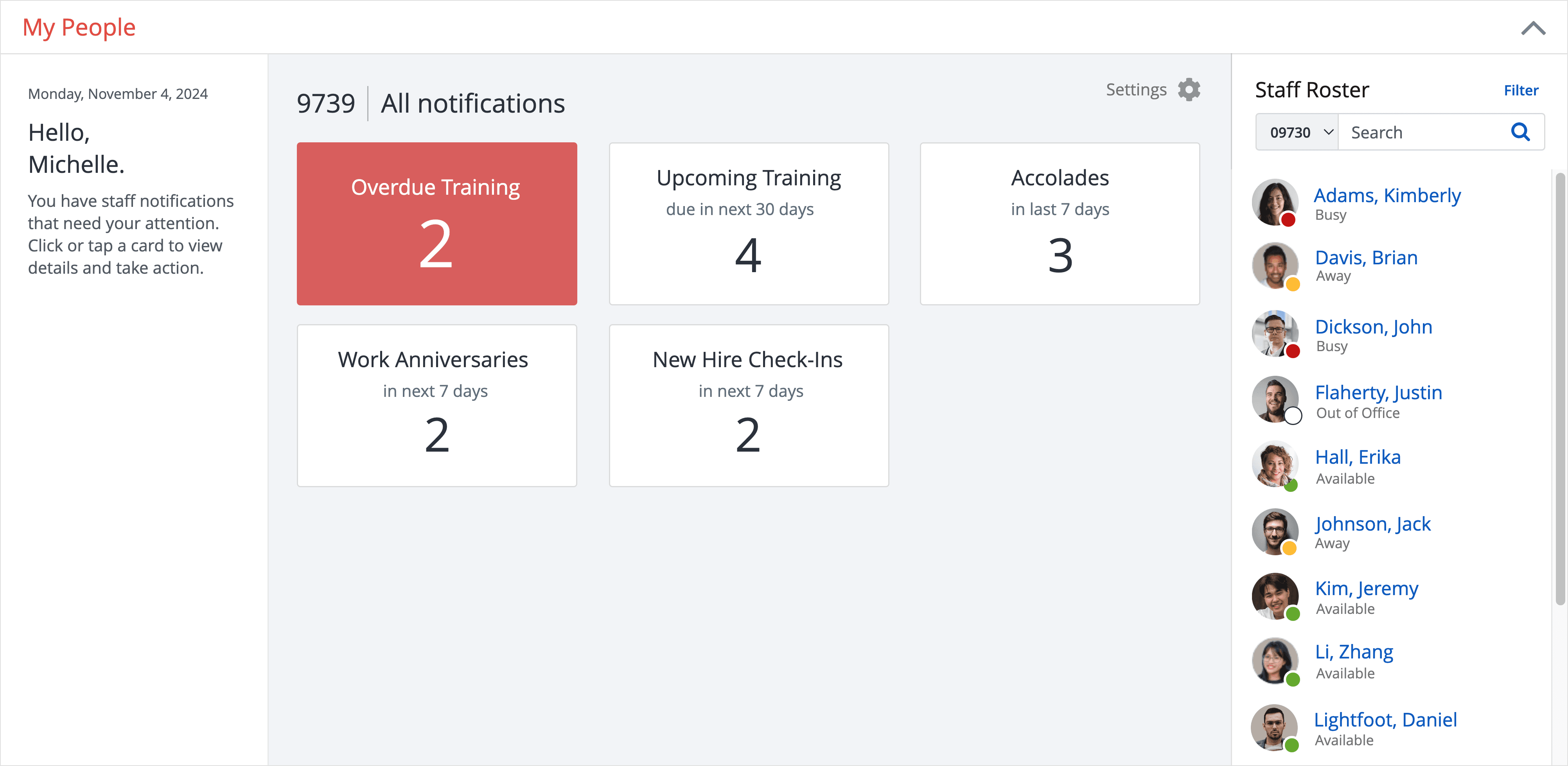
Once we had gathered a sufficient amount of feedback and finalized our wireframes, we created prototypes of the dashboard. I designed and tested high-fidelity prototypes with managers, validating design decisions and identifying most impactful features.

Above: "My People" manager dashboard landing screen

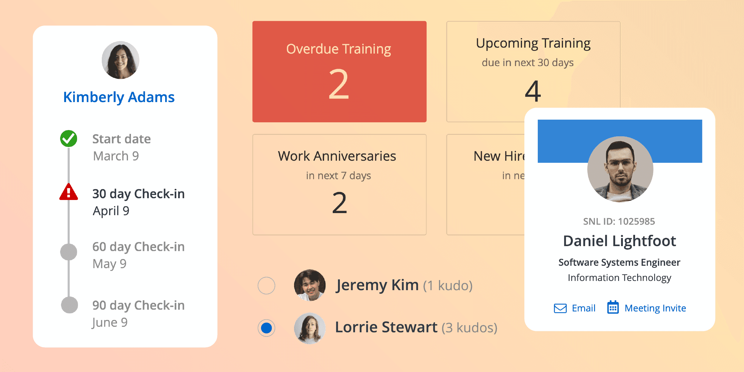
Above: Staff profile page with contact information, job details, accolades and ability to perform quick actions, such as schedule a meeting
Above: Accessing training-related sections of the tabbed interface where managers can take action directly from the dashboard
Above: Observing work anniversaries and staying on top of new hire check-ins were highly requested features of the dashboard
Above: Customization of the dashboard appearance and notifications
