MY ROLE
UX Research, UI Design, Front-End Development
TIMELINE
2018 - ongoing
Challenge
Sandia National Laboratories' intranet applications suffered from inconsistent design patterns and interactions, hampering workforce productivity and user experience.

Above: Examples of the disparate designs across applications at Sandia
Objectives

Improve consistency and cohesion across applications by providing a set of design standards, patterns, and documentation of usage and best practices.

Provide a set of reusable UI components and design libraries that enable teams to work more efficiently without having to reinvent the wheel.

Enable an open-sourced, cross-functional platform where designer and developer feedback from the commuinity can be given and improvements continuously made.
Results
The Thunderbird UI Design System made an immediate impact on the Sandia intranet.
Users noted a drastic improvement in the consistency of application interfaces and interactions.
Application teams noted the time savings of Thunderbird UI, in that UI components wouldn’t have the be styled and developed over and over again.
While there was some reluctance to implement a new system, our team communicated the benefits of Thunderbird UI through outreach and support.
Our design system became an integral part of the software development lifecycle and a requirement for most internal applications.


An estimated 30% decrease in the amount of time required for application teams to design and build new applications.

A drastic improvement in the visual consistency and experience within applications across the intranet.

Established a shared language and improved communication between design and development communities across Sandia.
Research
User Interviews and Affinity Diagramming
First we conducted user interviews across Sandia's 12,000+ workforce to understand app usage patterns and employee needs.
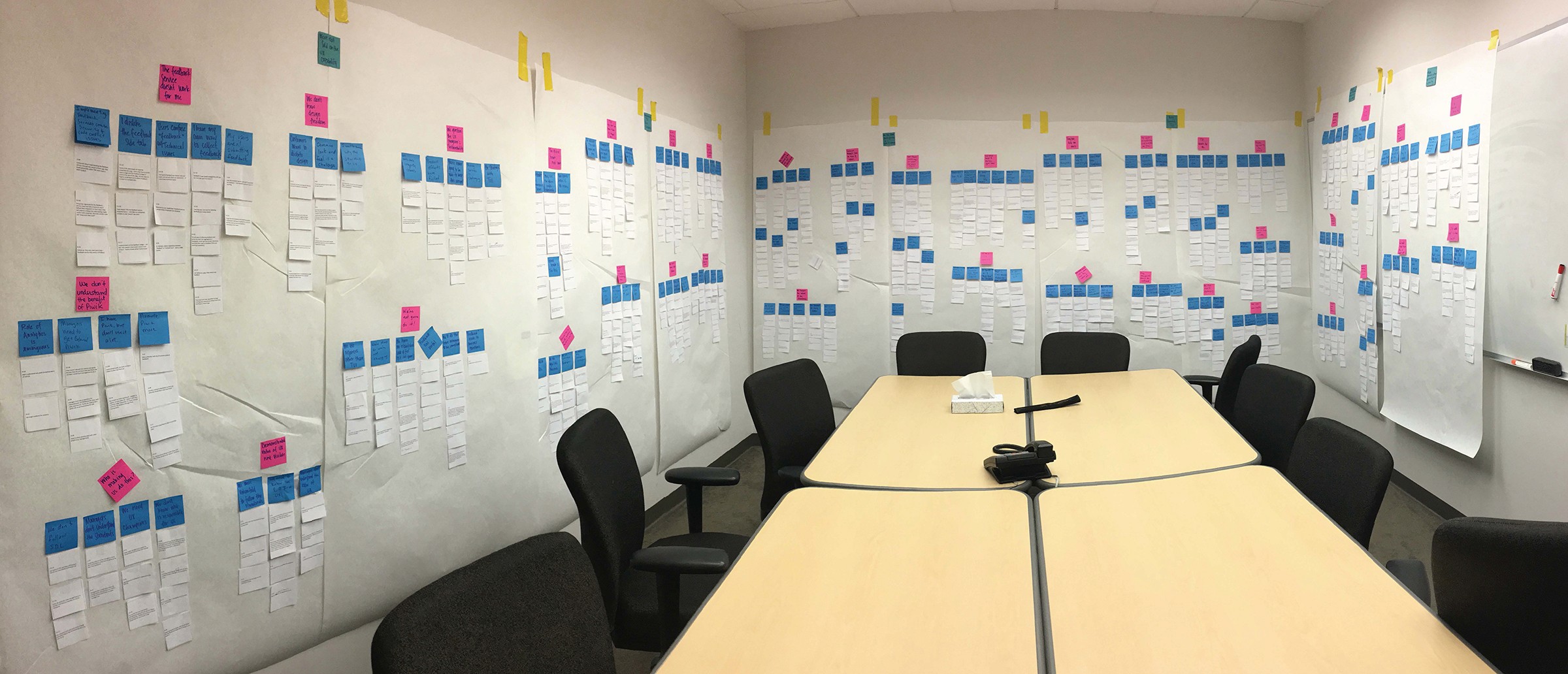
We conducted targeted interviews with application development teams to identify design system use cases. Once complete, we analyzed user pain points and identified patterns through affinity diagramming. This helped to establish core system requirements.

Above: On-site affinity diagramming activity
Competitive Analysis
Analyzed leading enterprise design systems including Atlassian, IBM, and USWDS to identify best practices and innovative approaches for our system architecture.
In addition to our employee research, I conducted a analyzed other enterprise design systems across including Atlassian, IBM, and Adobe to identify best practices and draw inspiration for our system.
Design
Our component design philosophy was influenced by Brad Frost's Atomic Design principles, which breaks down components into five distinct organic levels. This approach to designing systems helped make this effort more manageable, efficient and consistent.

We strategically prioritized design system components based on usage data with a lean team of 5 designers, researchers and developers. I created comprehensive documentation and maintained a centralized wiki to track design and development progress.

Above: Example of components documented in our wiki with status updates for design, development and documentation
I led design reviews to establish system components and foundations, defining core typography, color, and spacing standards through both in-person and remote team collaboration.

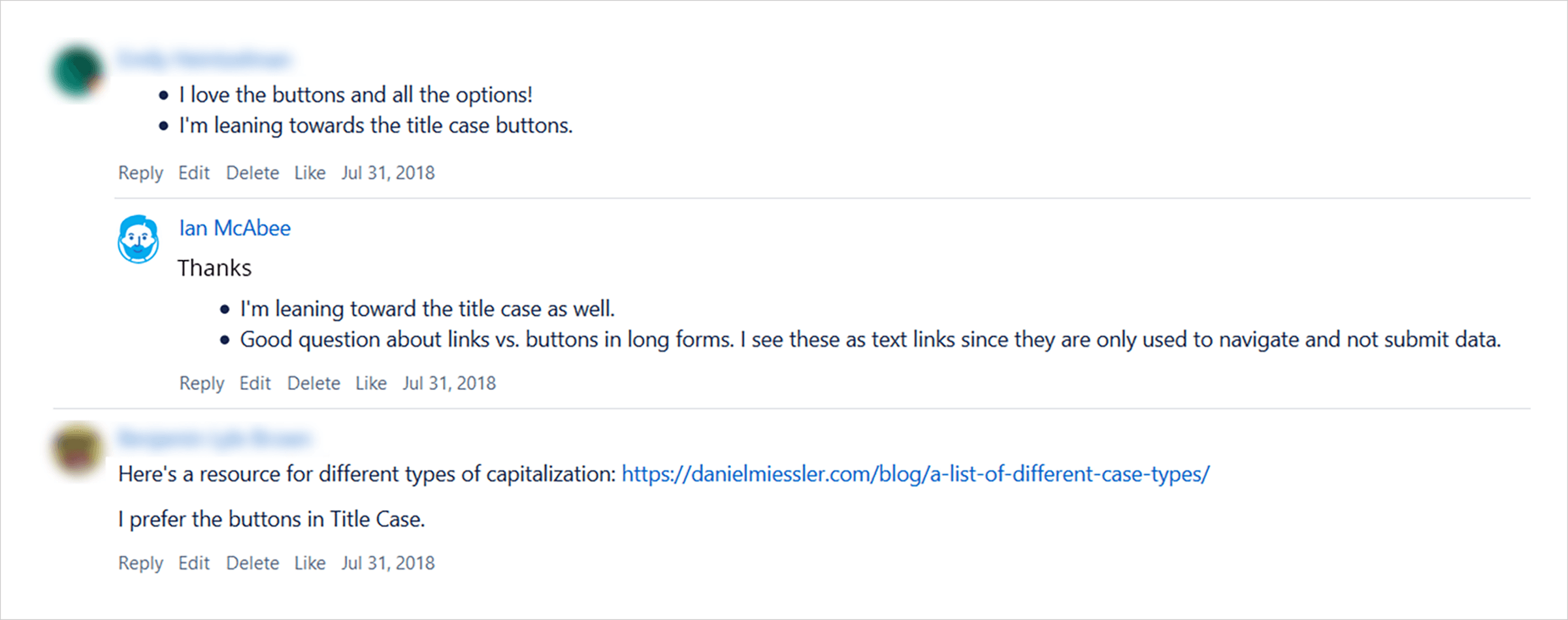
Above: Example of communication about design work in our wiki space
As we designed components, we documented design attributes as design spec files for reference. Spec files were created in Sketch and shared across the team. The would be very valuable later as reference when we moved to development.

Above: Example of Accordion component padding specs

Above: snl-blue, a primary color in our palette

Above: Examples of various component designs in Thunderbird UI
Presentation Site
Wireframing
I created wireframes and designed the documentation site for showcasing design system components, foundations, and resources. In this activity I refined information architecture through user feedback sessions and hallway studies.

Above: Low-fidelity wireframes of the Components page (top) and Accordion page (bottom)
Interactive Prototypes
Once low-fidelity wireframes were reviewed and finalized, I created high-fidelity interactive prototypes in Axure, incorporating refined visual designs and key functionality. The prototypes enabled us to validate design decisions through usability testing with real-world task scenarios.

Above: Thunderbird UI home page

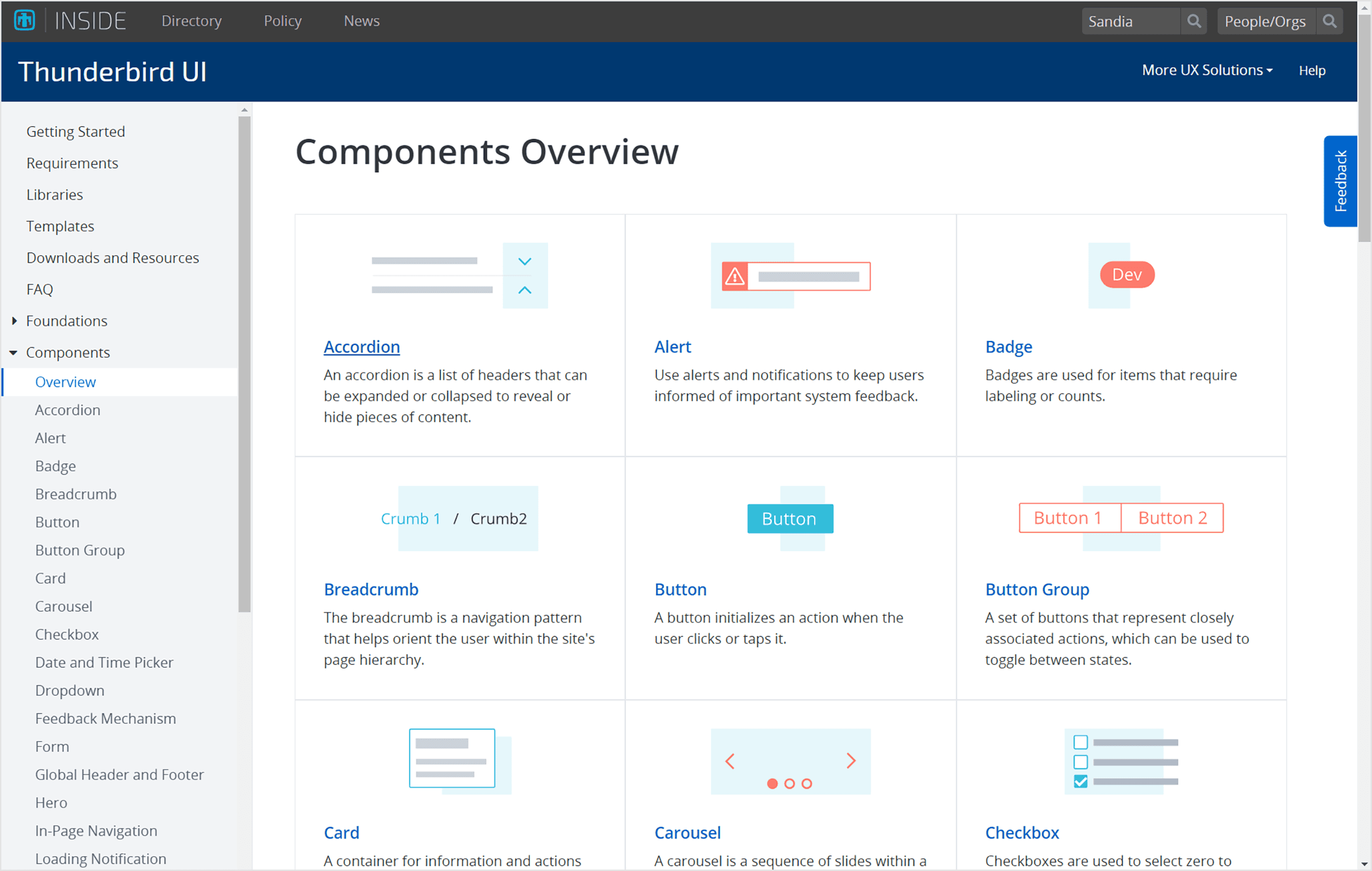
Above: Components Overview page listing Thunderbird UI components
Documentation
I authored much of the Thunderbird UI documentation, which provided guidance, best practices and “do’s and dont’s” about using our components. Users found the documentation immensely helpful when implementing Thunderbird UI in their applications.


Above: Example of Alert documentation where I documented best practices for users of Thunderbird UI.
Designer Resources
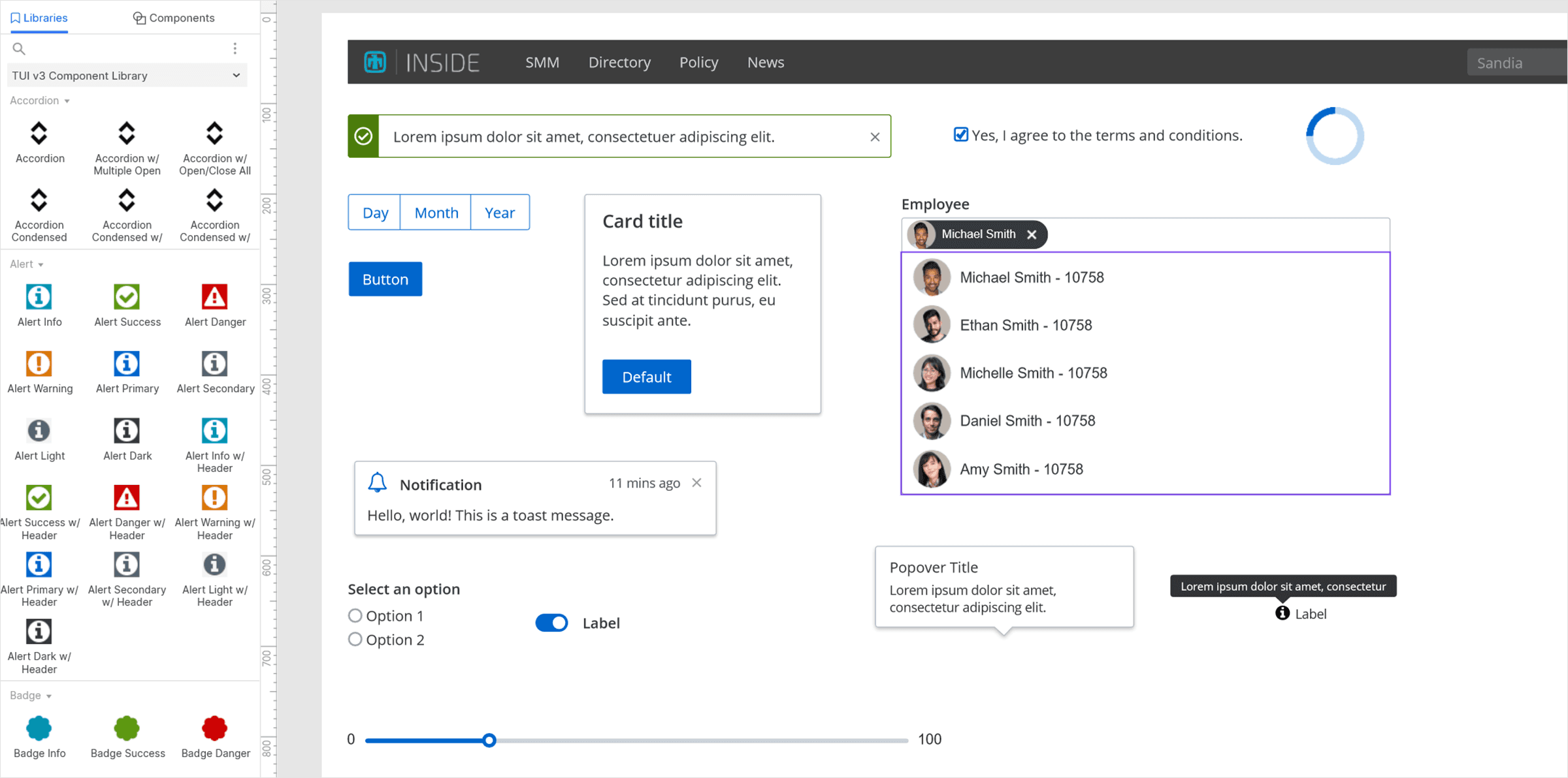
I created comprehensive design libraries in Axure and Sketch to enable teams to design more efficiently and consistently. This also promoted the usage of Thunderbird UI across teams at Sandia.

Above: Axure component library improving rapid prototyping in Axure
Project shift / cross team collaboration
While Thunderbird UI proved to be very successful, I proposed combining the various design services under one roof, including web, communications and marketing. Thunderbird UI was renamed "Thunderbird" and we re-evaluated the information architecture of our site to encompass the various design groups.
I modified the design of the site to be a more holistic representation of design at Sandia and incorporated content from each of the groups involved.

Above: Revised home page design to include branding and communications

Above: New Web landing page design
