Challenge
With a limited amount of time in her schedule but a desire to reach more clients, Katy Estes wanted to provide virtual workouts and wellness resources. She proposed a subscription-based e-commerce site where customers could benefit from her expertise to improve their well being.
Objectives

Provide a seamless sign-up process for customers to subscribe to monthly fitness programs and wellness resources.

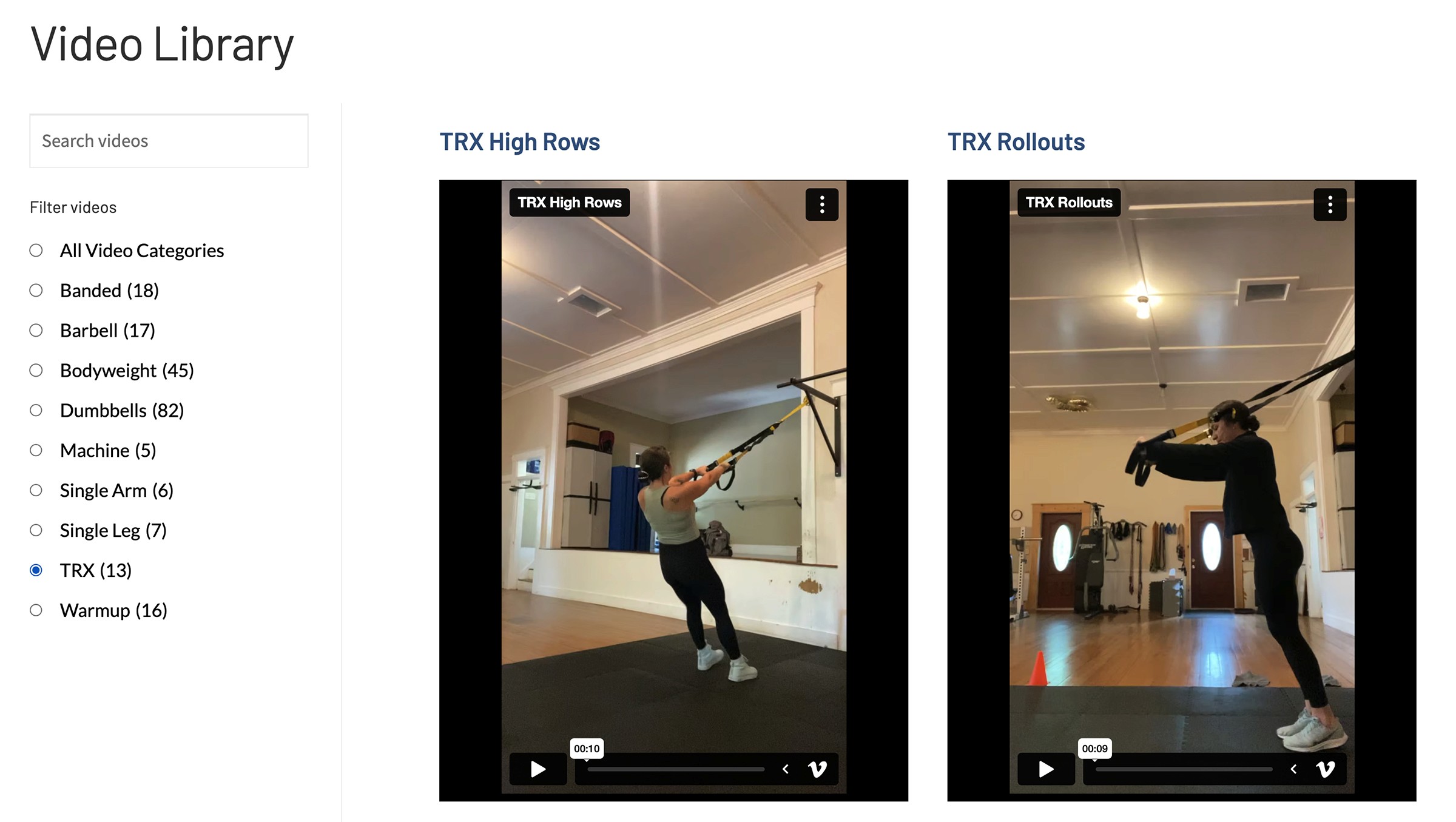
Design an accessible and categorized library of videos and wellness resources for subscribers to engage with.

Provide Mind Soul Body with a platform where content and subscriptions can be easily updated and managed.
Results

Following the release of Mind Soul Body, we have seen a steady increase in subscribers and site engagement.

"I absolutely loved working with Ian. He is very professional and did a great job keeping me on track to finish my new website. His final creation was better than what I could have imagined!" – Katy Estes

Following the release of Mind Soul Body, we have seen a steady increase in subscribers and site engagement.
Research
Requirements Gathering
Working collaboratively with the customer, I determined what functionality was needed most and what content she wanted to prioritize. These requirements were documented and were at the core of the site design.
Competitive Analysis
My investigation into this new space started with the review of other fitness-related membership websites that the customer referred to me. This provided me with a great frame of reference and to explore common approaches to the subscription-based e-commerce model.
Design
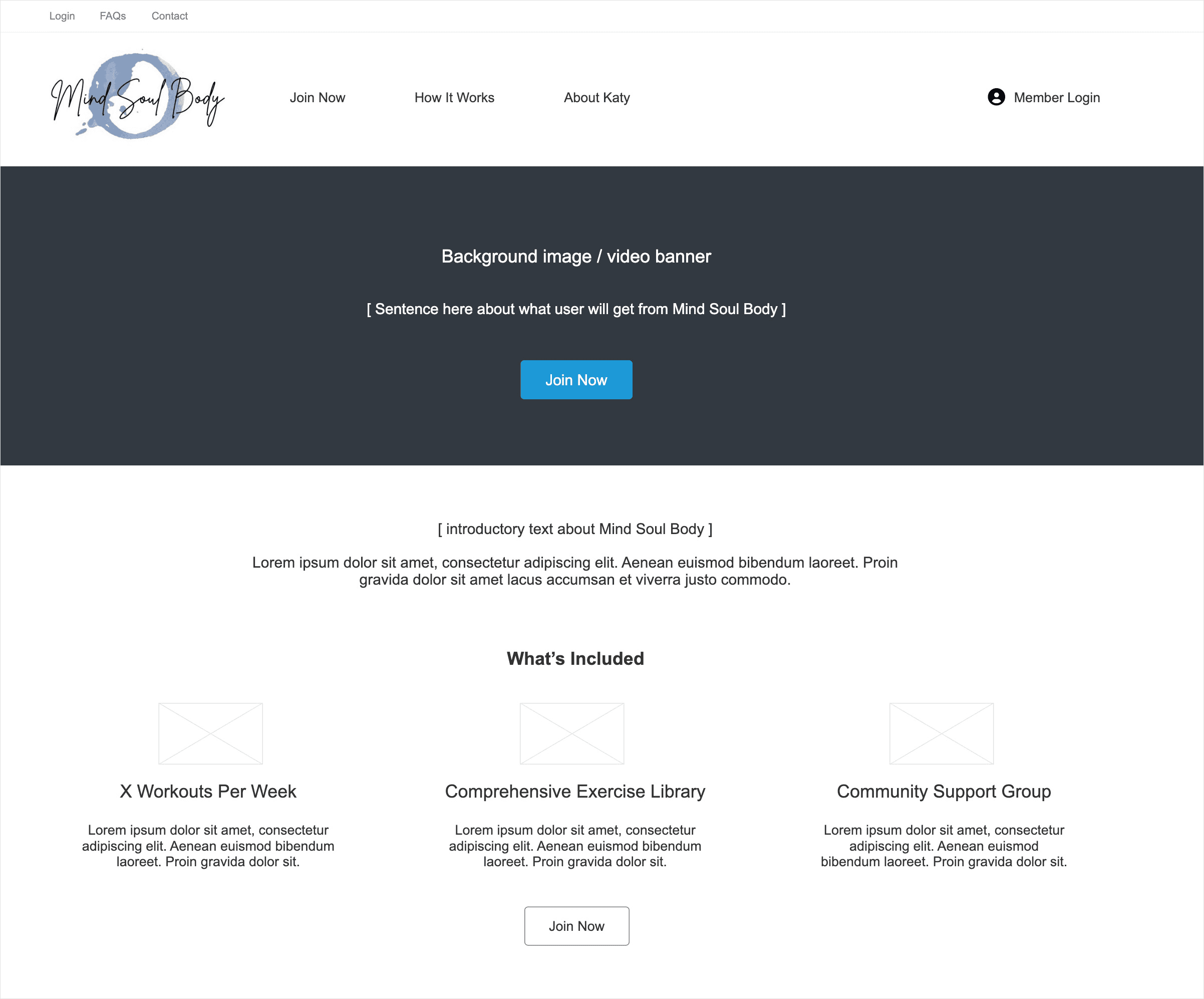
Low-fidelity wireframes
Wireframes enabled the customer and I to begin our conversation about the website design. These wireframes demonstrated the basic layout, interaction patterns, and user flows. These were iterated on from user feedback and this initial design iteration enabled us to reach a basic design we were ready to pursue.

Above: Example wireframe that enabled the customer to visualize my initial design ideas for the home page.
High-fidelity prototypes
Once wireframes were finalized and core user flows were established, I created high-fidelity prototypes to demonstrate the visual design of the site. I designed each of the primary screens in Figma to provide the customer with a finished design including branding, color and typography.

Above: Various examples of design ideas in Figma for the customer to review.

Above: "How it Works" page design with a membership summary and introductory video.


Above: "Join Now" page enabling the user to sign up for a monthly or yearly fitness subscription.


Above: Providing a video library to members was an integral part of the design.

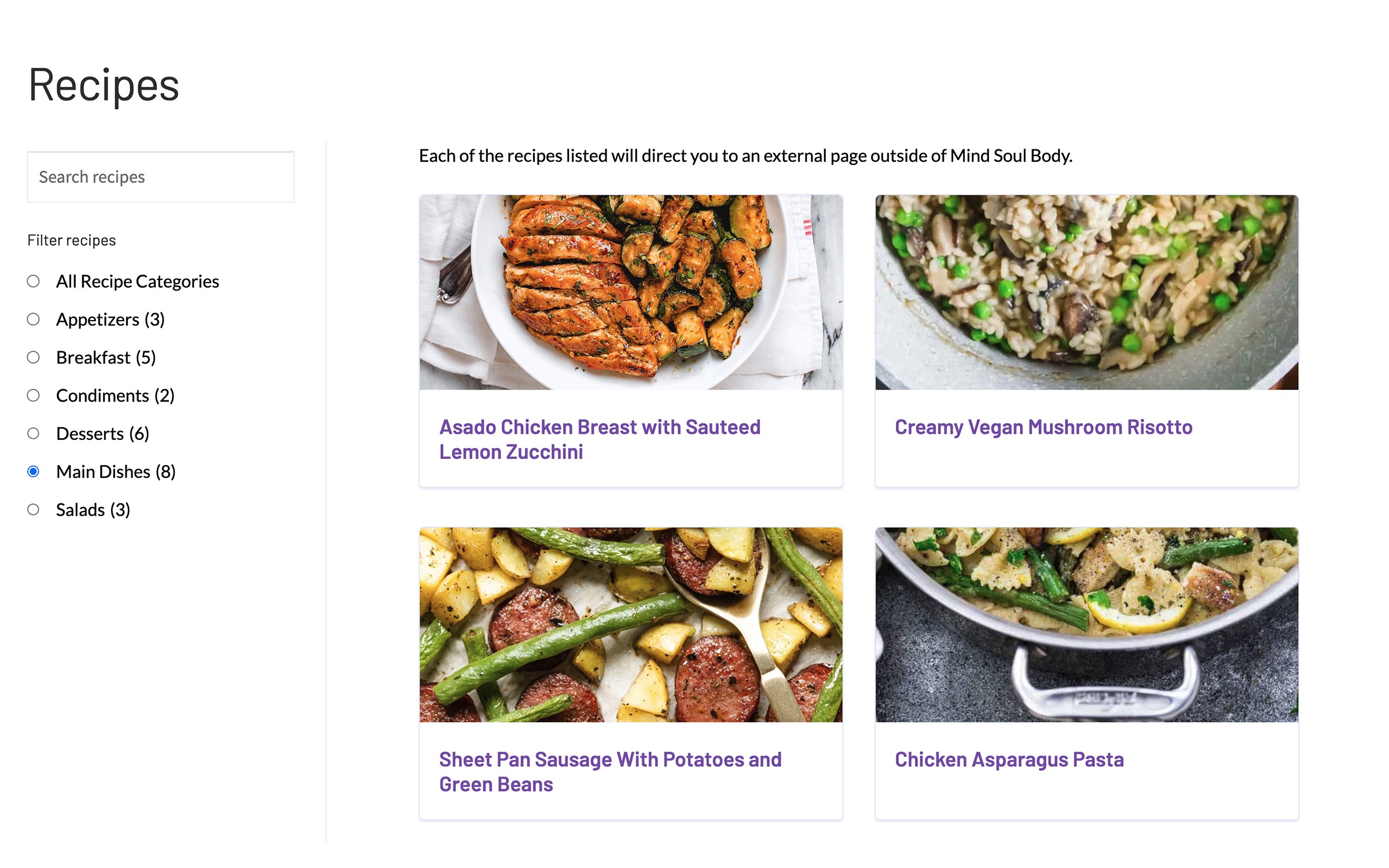
Above: Recipes were another membership benefit that required a filterable page with visual impact.
